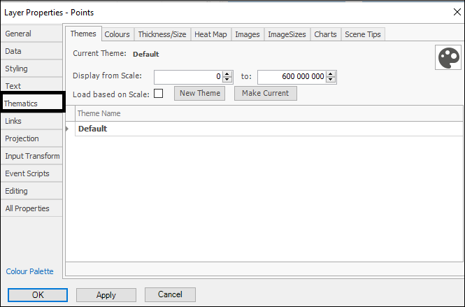
❖In the Thematics tab you can create various themes for your layer. This is gone over in the SpatialXL Guide, Theming section. Here I will cover ones that weren’t touched on, starting with Thickness/Size. In this tab you can create a theme that will make the points or elements bigger in the layer depending on their value in some column in the layer data. For example, I will choose the TOTAL VOLUME column to do this on:
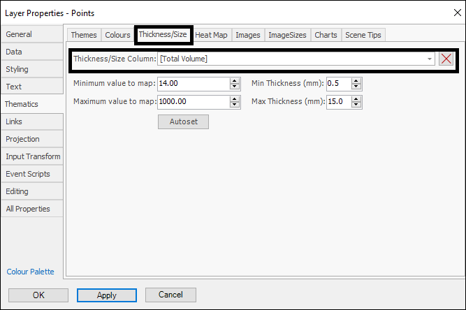
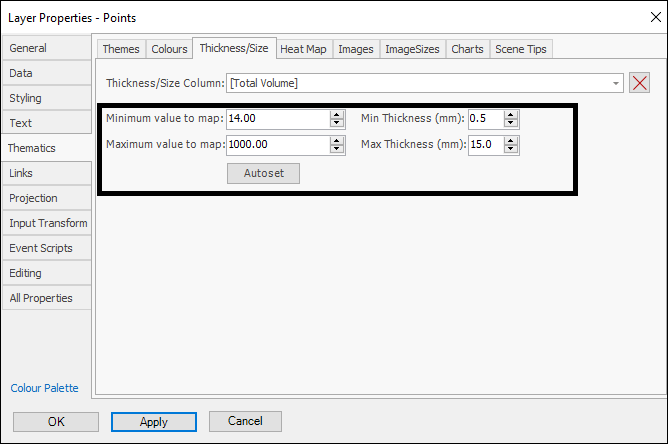
Minimum value to map and Maximum value to map can be auto set based on the values in your layer by using the Autoset button. You can then set the Min and Max Thickness(mm) for the elements:
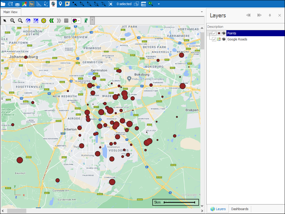
Click OK (or Apply first to see how it looks) when done and your theme is applied:
❖With the Heat Map tab you can create a heat map theme. First, choose the column in your data you would like to do this for by Heat map column. Then by Aggregation choose what type of calculation you would like done in aggregating the values(Note: you can also save predefined settings for this, indicated by the palette icon on the right, as gone over under Styling):
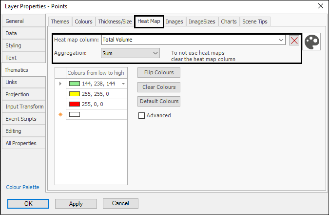
Then you can change the colours for the map if you’d like by clicking on them. Flip Colours will change it around so that the highest value colour is the lowest value colour and vice versa. Clear Colours will clear the colours from the box and Default Colours will set the colours back to the default if changed. If you tick on Advanced you can make the heat map more precise by increasing the number of cells it uses:
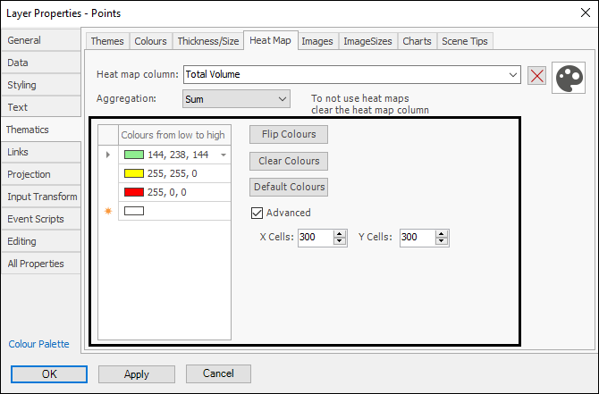
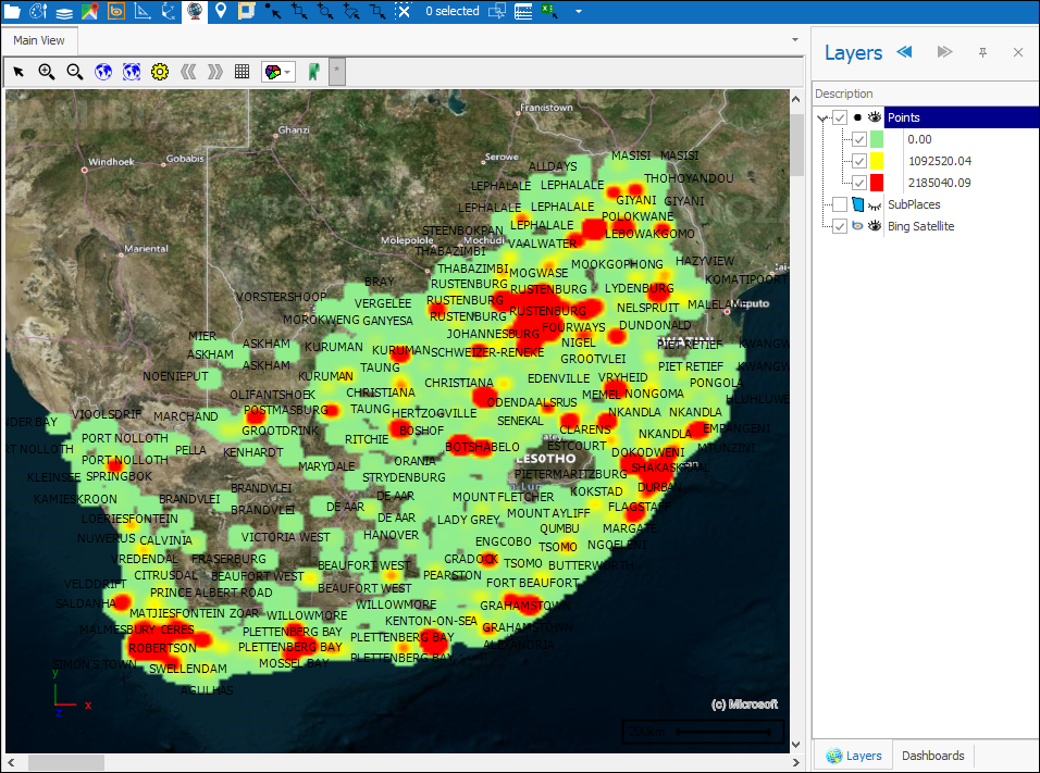
Click OK (or Apply first to see how it looks) when done and your theme is applied:
❖Under Charts you can set up a theme that will show charts for the elements in your layer. You can choose between Bar and Pie Chart:
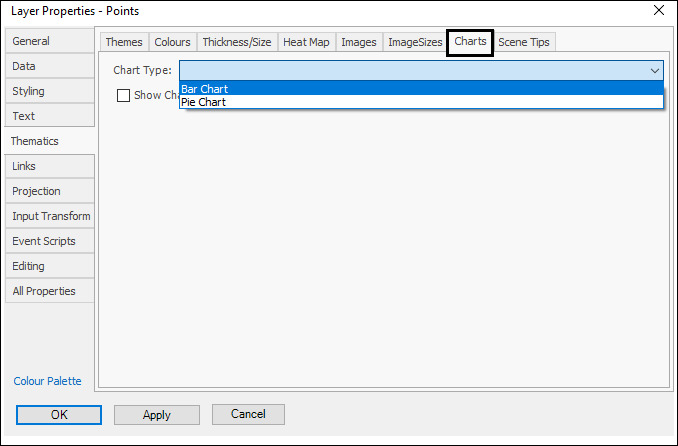
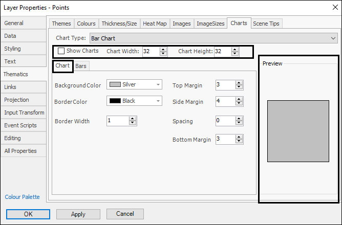
In the case of a Bar Chart it has the following dialogue. First, make sure to have Show Charts ticked on so that any charts you set will show. Then you can set your desired Chart Width and Chart Height. In the Chart tab you can then set the various properties of the chart, a Preview of the chart is shown on the left:
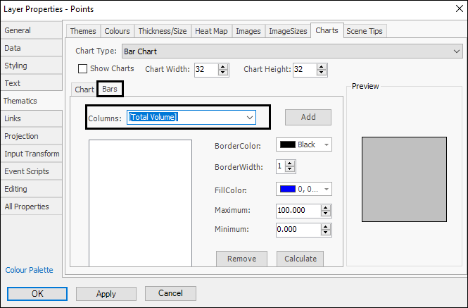
In the Bars tab you will choose the columns in your data you would like to use as bars in the chart:
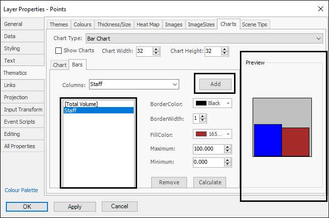
After choosing each column click Add to add it as a bar:
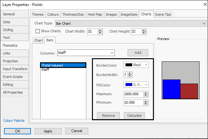
You can then set various properties for each bar (first click on the bar you want to edit in the box). Then calculate the range of the data for the bar by clicking Calculate. To remove any bar you can click Remove:
Click OK (or Apply first to see how it looks) when done and your theme is applied:
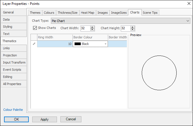
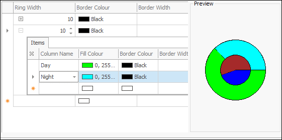
❖A Pie Chart theme is set up as follows. Make sure Show Charts is ticked on so the chart will be displayed, then set Chart Width and Chart Height. Click on the row in the grid area under Ring Width and choose the width for the first ring of the chart (you can then choose its Border Colour and Border Width):
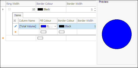
Now click below the row and you will see there is now a plus symbol which you should expand. Choose the column in your data for this part of the chart (you can then choose its Fill Colour etc.). In the row below choose the next column to include in your pie chart, as usual you will see a preview of the chart on the left as you create it:

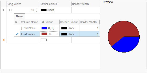
❖You can then collapse this row and then click in the row below and follow the same steps to add another ring if you’d like:
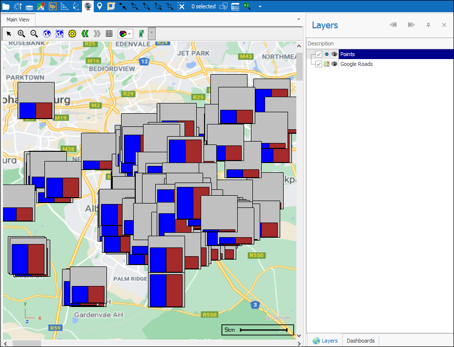
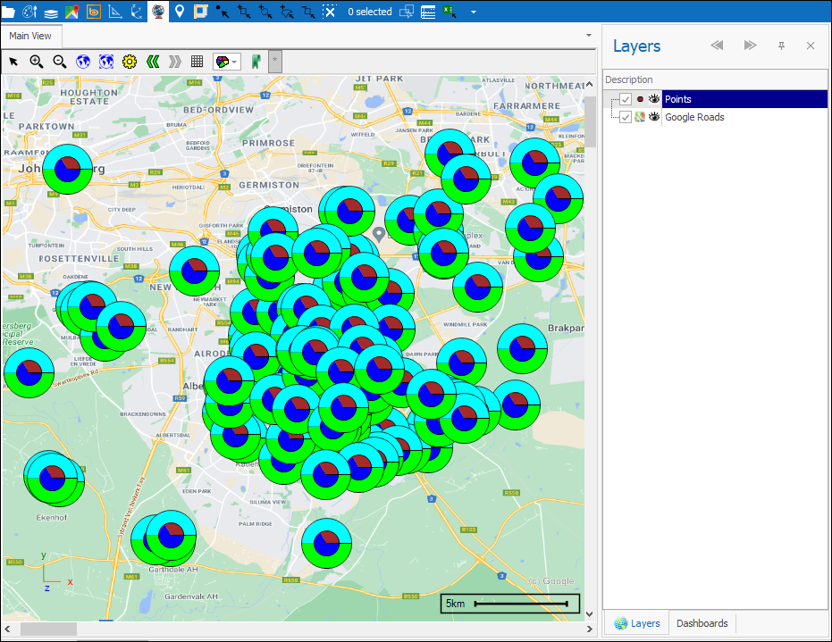
Click OK (or Apply first to see how it looks) when done and your theme is applied:
❖Scene Tips is fully described in the Scene Tips manual.