❖Often when working in GIS you can get some images that are only one band such as TIF images showing world population data. These images display only one band, so the colour is monochromatic, and they will have pixels with a value indicating some attribute such as the number of people in that pixel area. A pixel with the value zero will display as black and will display lighter on a greyscale towards white with higher values.
Using our tools we can display and analyse these images meaningfully.
❖As an example here, I will bring in a TIF file I got from the WorldPop site showing population density data for Uganda, this data is shown in 100m by 100m pixels:
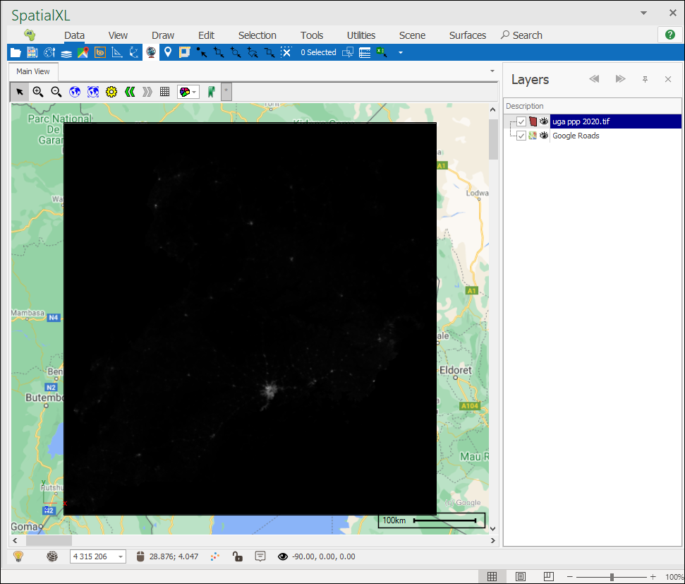
You can see as I’ve brought it in, that it is mainly a black square and not very useful to me. Zero values are black and so there is a lot of places where there are 0 people per 100m block.
❖The first thing we will do is query the image stats to see how the data looks:
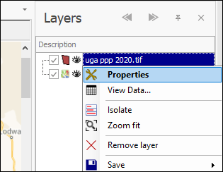
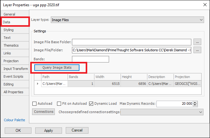
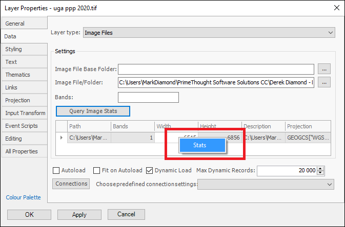
Firstly, we can see here there is just one colour band in the image, we will query further by right clicking and then going to Stats:
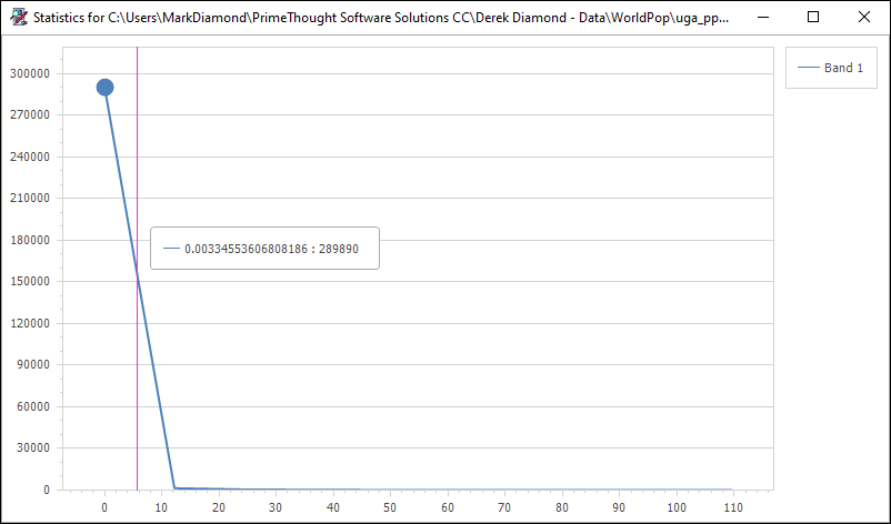
We can see from this that most of the pixels have a low value of population density, the population per 100m being shown on the horizontal scale and the number of pixels being shown on the vertical scale. This will cause the image to just show mostly as black.
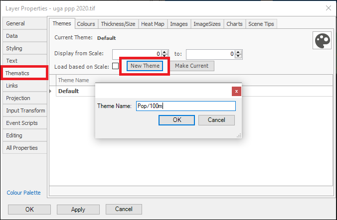
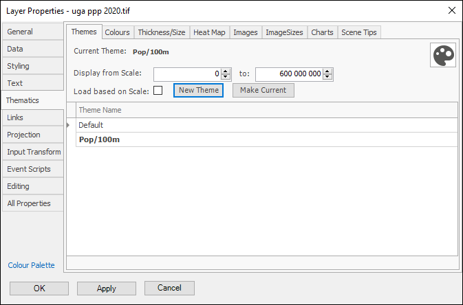
❖In order to make this image more meaningful we can use our theming tools. Go to Thematics in the Layer Properties and create a new theme:
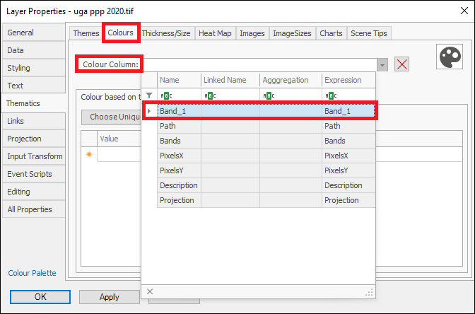
❖Now, go to the Colours tab and drop down on Colour Column and you will see there are a number of columns in the data you can theme on, but the one that we are interested in is Band 1:
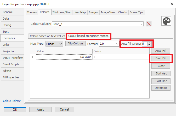
❖Now, go to the Colour based on number ranges tab since we will be colouring on a number range, then choose Best Fill to get the best range of values for the display of your data, if you want more values than the default 5 in the range, then change this to the desired amount in Autofill values and then click Best Fill:
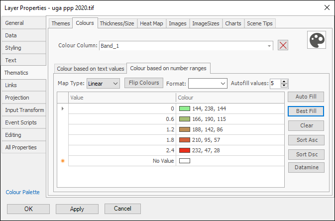
You can change the colours and numbers as desired; I am happy with this so I will leave it and click OK:
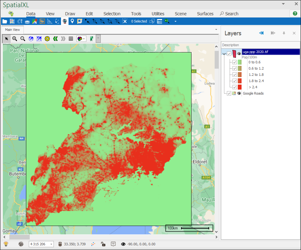
As you can see now we have a much more meaningful picture, we can now tick off the zero values since we are not interested in them:
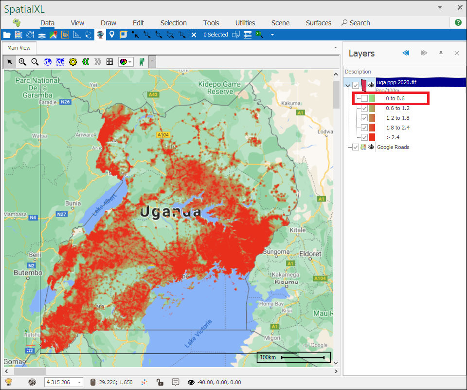
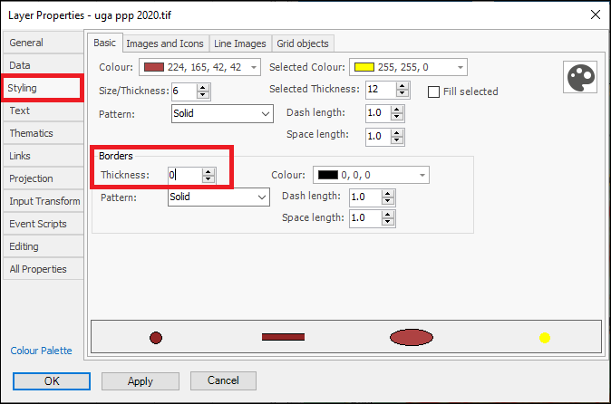
To get rid of this outlining border we can simply set our border thickness as zero in the Layer Properties:
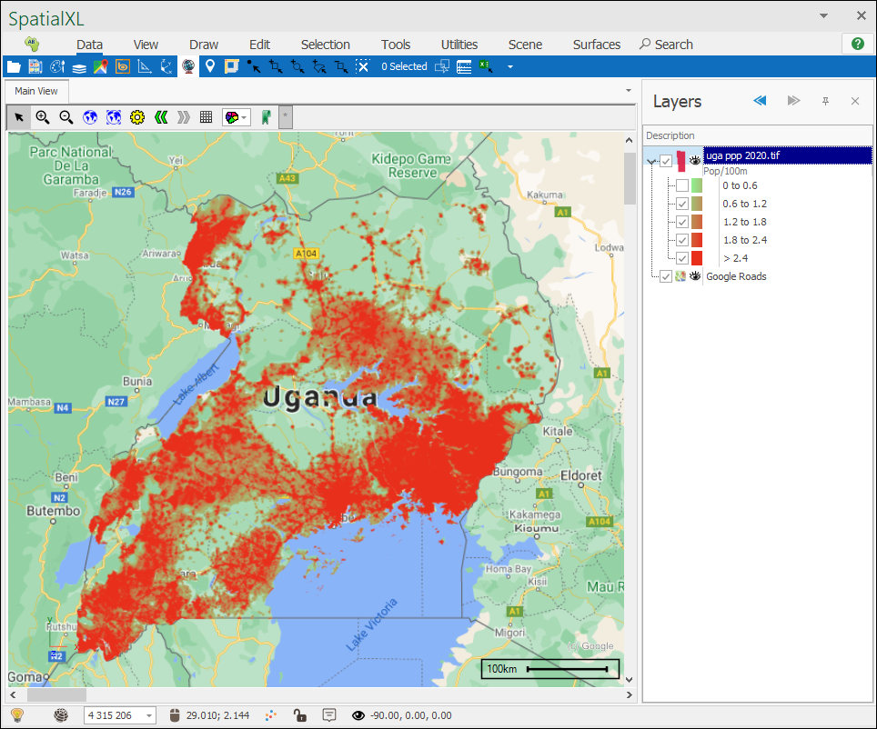
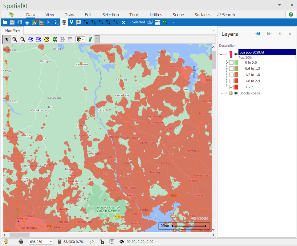
❖We can now analyse the data in this image nicely and tick on and off the values we do and don’t want to see, for example here I ticked on only those places with a population of more than 2.4 people per 100 meters:
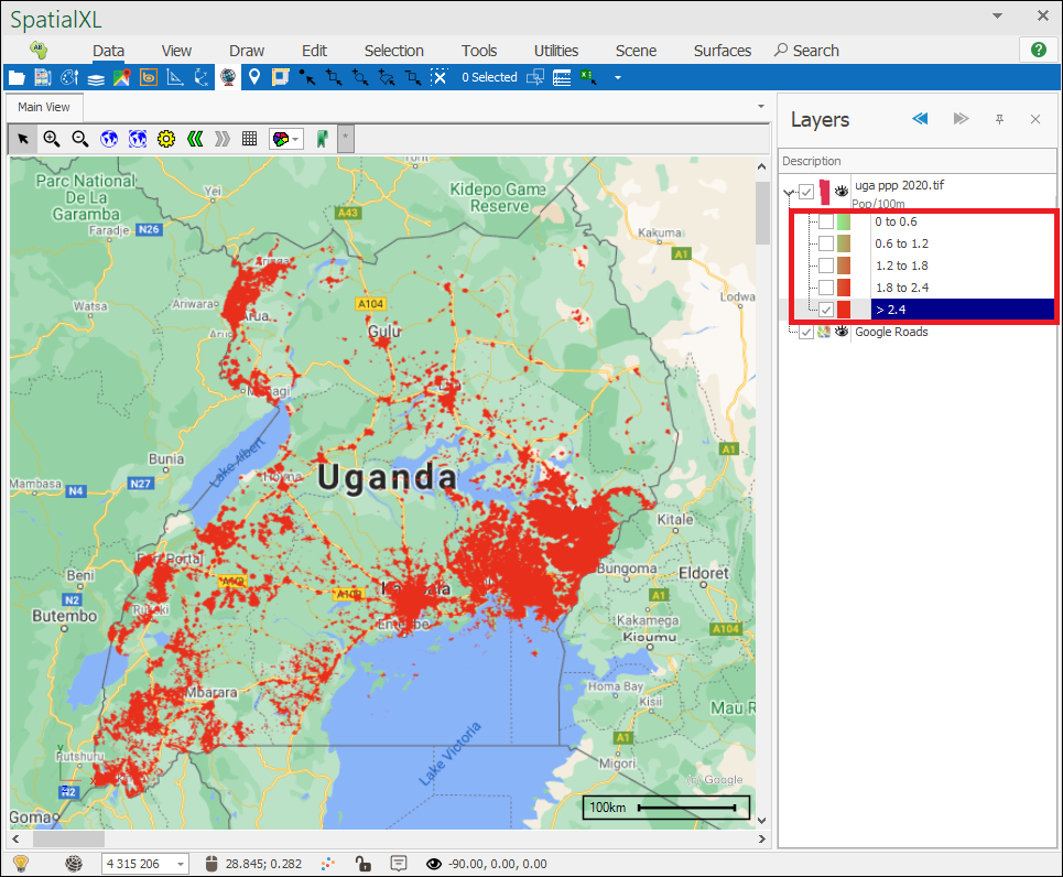
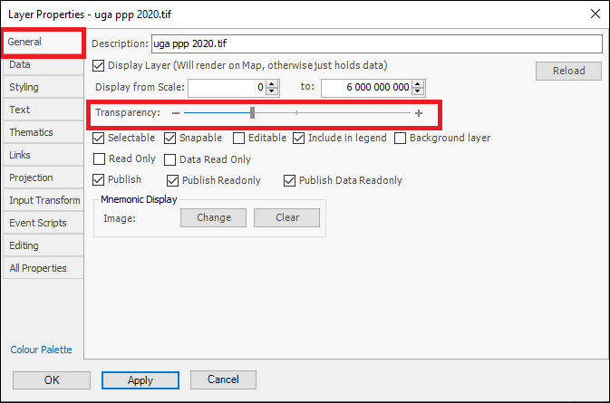
❖To see the underlying places on the map better we can also make the image more transparent in the Layer Properties:
